Tab completion in Instantbird 1.2

We’ve made some major improvements to the tab completion of nicknames in IRC channels (and other chatrooms). The goal, as always, is to make it “just work” (so you can think about more important things!).

Simply press TAB to complete the first couple of letters you have typed:

image0

To undo the completion, just press Backspace as usual.

If there is no unique nick that fits the bill, Instantbird tries to guess which nick you mean from the context. For example, if you have recently been pinged by someone, that nick is preferred. Otherwise it just completes as much as possible, and shows you a list of alternative completions:

image1

You can then always press TAB again to cycle through these candidate nicks until you get the right one:

image2

(Shift+TAB will cycle through the list in the opposite direction.)

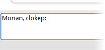
Notice how Instantbird automatically added a colon after the nick, as we were addressing someone at the start of a message. And if you add another nick, you get a comma-separated list:

image3

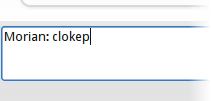
Of course, sometimes that may not be what you intended. So if you delete the trailing colon by pressing Backspace, the punctuation adjusts accordingly:

image4

Don’t forget you can also reply to any message by double-clicking it! This will add the sender’s nick to the beginning of the message.

User icons

Another very visible change between Instantbird 0.2 and 0.3 is the possibility to set a user icon and a display name.

screenshot of the contact list with a place holder icon

You will see a place holder icon at the top of the buddy list, just click it (this will open a file picker) to set an icon. The icon will be automatically resized and converted to fit the various size and format requirements of the IM networks you use.

Similarly, click the “Display name” place holder to edit it. This name will be visible in your contacts’ buddy lists (unfortunately this currently works only for MSN).

Here you go, your friends will now easily recognize you:

screenshot of the contact list with an icon and a display name

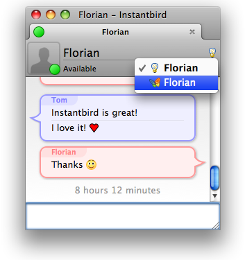
Conversation windows have also been changed to display your contacts’ icons and some more information (display name, status message, …):

conversation with an info bar showing the user icon

I can already hear some comments about how much space this new information bar takes (or wastes) in all conversation windows. Yes, this takes a lot of space, we know. People tend to use big or very big windows for chatting (sometimes even full screen!) but if you like the ability to chat in small windows, don’t worry, we love you too! Just resize the window and this information bar will shrink to ensure you still see the actual content of the conversation:

conversation with a smaller info bar

And for very small conversation windows, the bar will completely disappear, leaving only the strictly necessary user interface:

small conversation without the info bar

Better contact list

The contact list was identified as a weak area of Instantbird 0.2. It has been dramatically improved for Instantbird 0.3 which we plan to release next week.

Tags

Goodbye groups

Like most IM clients, Instantbird 0.2 had each contact placed in a group, leading users to organize contacts a bit like files are placed in folders on the disk.

While this seems ok at first, placing contacts inside groups doesn’t work well when thinking of the contact as a person. Don’t you have a friend (group ‘friend’) who is also a coworker (group ‘colleagues’)?

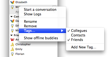
For this reason, with Instantbird 0.3 we replaced the notion of “Groups” with the notion of “Tags” throughout the user interface. While groups used to be containers for your contacts (it was possible to move a contact from one group into another), tags are additional data attached to the contact (you can add or remove tags on a contact, but no longer ‘move’ a contact) and thus a single contact can have multiple tags. To change the tags attached to a contact, use the “Tags…” context menu item of the contact; it shows a list of the existing tags with a check mark next to the tags attached to the selected contact. Checking/unchecking a tag in this list will attach/detach a tag from the contact.

Tags menu

Hidden tags

It’s pretty common when using several accounts of different protocols on a multi-protocol client for the first time to have contacts scattered around in lots of meaningless tags. These contacts are typically those that have never been moved before and are still in whatever the default group of the various previous clients were.

As moving each of these contacts out of these meaningless groups is not really an interesting task, and sometimes is even impossible (if the server doesn’t allow us to move it), we have designed a more efficient way to forget the annoyance caused by the pointless resulting tags: when hovering a tag in the contact list, you will see an [x] icon. Clicking it will hide the tag (after showing an explanation the first time).

Hide tag icon

It’s possible to manage the list of visible tags (to unhide a tag) from the “Visible tags…” context menu item.

Contacts which haven’t been associated with a visible tag will be displayed in a special “Other Contacts” tag, always at the bottom of the contact list.

Grouped contacts

If several networks are usable to IM the same person, you will no longer be annoyed by seeing that person listed several times in your contact list. Just drag and drop one of these contacts onto another and Instantbird will know they are both ways to contact the same person.

During future conversations, if your contact suddenly starts talking to you from a different network, the conversation will continue in the same tab. A system message will be displayed in the conversation to unobtrusively notify you of this change.

If you want to start talking to a different account of your contact, you can do so easily with a click on the protocol icon at the top right of the conversation UI:

Talk using a different network

When starting a conversation from the contact list, Instantbird will automatically select the best way to reach your contact, based on availability information and your preference with regard to the various ways to contact this person. You can change this preference by expanding a contact (with the down arrow icon) and then using drag and drop to reorder the accounts.

Expanded contact

Other noticable changes

  • The contact list is now sorted: both tags and contacts inside a tag appear alphabetically sorted.
  • Changes in the displayed information are smoothly animated, making them at the same time easier to understand and less interrupting.
  • Closing the contact list window, which is not needed all the time, will no longer close Instantbird. On Windows and Linux it will be minimized to the system tray (this behavior can be customized in the Preference dialog); on Mac it can be easily reopened from the menubar.

Introducing magic copy

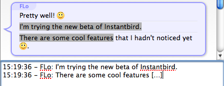
The surprise and enthusiasm of a few people about the “magic copy” feature I mentioned briefly at the end of my previous post introducing time bubbles reminded me that we forgot to introduce this feature when it landed for Instantbird 0.2 as part of our implementation of the Adium message theme system.

We decided to use this theme system because it seemed nice overall and was already used by a few other clients as well. However there was something we really didn’t like: using a customized message theme could make copied data from the conversation really hard to read, to the point that it would be unsuitable for sending a quote via email.

As this may not be very clear yet, let me give an example:

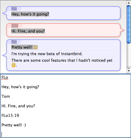
Copying from a conversation without the 'magic copy' feature

This is the text we get when copying the selection to the clipboard and pasting it. This is without our “magic copy” feature of course.

I should also note that the Bubbles theme used for this screenshot is not the worst in this regards. I’ve seen in the description of some themes (not designed for Instantbird) that they were “clipboard friendly”, which indicates the theme author took this problem into account and probably had to make some trade-offs between the visual appearance and the usability of copied conversations.

As we were not satisfied with this situation (which either makes copying from the conversation poorly usable or restricts theme authors’ creativity), we developed a different system that instead of serializing the selected HTML attempts to detect which messages are selected, and to “prettyprint” them based on what Instantbird knows about the message, rather than what is visible and selected.

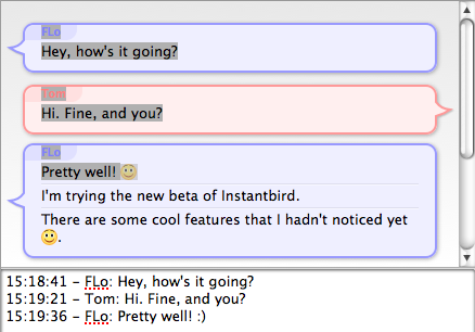
This is the result:

Same conversation copied with magic copy

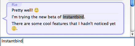
If only a part of a single message was selected, the username and timestamp won’t be added to the copied strings, it will behave like a normal text copy:

Copying a part of a single message

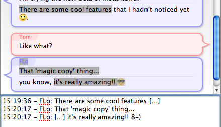
As we detect which messages are selected and even know if each message was fully selected or only in part, we can nicely add an ellipsis when a message was cut:

Ellipsis are added where messages are cut

This even works when using multiple-selections (press Ctrl on Windows/Linux, and Command on Mac to do this):

Copying parts of multiple messages

A few technical details: the template used to serialize copied messages is both localizable and customizable from about:config, it’s also possible to completely turn off this feature in case it ever causes some trouble (look for the messenger.conversations.selections.* family of preferences in about:config).

This feature has been turned on by default in Instantbird for over a year and nobody complained about it. Actually, it’s one of the features that is barely noticed because it just works, but it is something that is really missed if using another IM client after using Instantbird for a while.

Introducing Time Bubbles

Instantbird 0.2 was released with Bubbles as its default message theme:
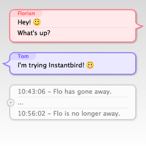
default message themes of Instantbird 0.2

The most common feedback we received from users that quickly switched back to Simple (the previous default) or another theme was that the lack of timestamp for each message made the theme unusable.

Some users have really passionate opinions about whether these timestamps should be shown or not. On one hand, people think it’s a useful piece of information that should always be visible, but on the other hand, people think it’s a waste of space on their limited screens. The common “solution” to this problem is to include a “show timestamp” preference, allowing each user to decide for themselves which of the two behaviors is the least inconvenient.

I don’t think that making the user responsible for choosing between two not-so-good options which one is best is a good way to address this issue. So soon after the 0.2 release, I started searching for better solutions.

I tried to identify what the information provided by message timestamps was used for, so that we could hopefully find something appropriate for the actual needs.

The starting points of my reflection were that:

  • timestamps, when visible, are most of the time ignored.
  • when they are actually read, the information they provide is rarely the information really desired, but only an indirect way to answer a valid question.

So then, I tried to identify which questions users who wanted to have their timestamps visible all the time had to answer. Here are the questions I found, and what I’ve implemented to provide human friendly answers to these questions:

1. How much time has passed between 2 messages?

That’s actually still an indirect answer to another question: has that person talking to me actually read what I said and thought about it before replying? Sometimes when receiving an answer that doesn’t seem to take into account what has just been said, it’s just that the message wasn’t read yet at the time the reply was written.

I believe having to read and compare mentally 2 timestamps to get that information is overly complicated and we can convey this information visually:
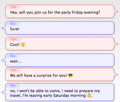
screenshot with 2 bubbles touching each other, and 2 bubbles with some space between them

The vertical space between Bubbles is used to show how much time separates messages. If 2 people talked at the same second, their bubbles will almost touch each other. If there’s been a pause between the messages, there will be some space between the bubbles.

In order to not waste too much space when 2 messages are separated by a long time, I decided that the first few seconds would cause a much bigger increase of the space than the next seconds and minutes (for the readers who care about the details: it’s a logarithmic representation of the time).

This makes it easy to see a difference in time just after a message was received (the very few seconds that make the difference between a likely-read message and a most-likely-not-read-yet message), but makes it hard to evaluate time intervals of several minutes. To address that, when messages are separated by over 5 minutes, the exact time is displayed between the bubbles in gray text:
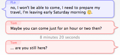
screenshot of 2 messages with over 5 minutes of interval

2. Is this message old?

This question is especially interesting when returning to the computer after being away, and having several conversations with new messages, to decide which one to answer to first. If a message has already been waiting there for an hour or so, the person has probably moved on already, and is most likely not actively waiting for your answer. However, if a message was sent only a few seconds or minutes ago, it’s reasonable to expect that the person is still at the other end and still remembers what was discussed.

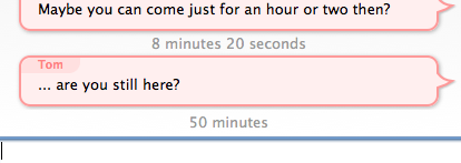
To answer this question, my proposition is to make the space between the latest message and the text input box vary exactly like the space between 2 bubbles. Unlike the time between 2 bubbles which doesn’t change, the time between the last message and now changes continuously, so displaying this time requires an animation: messages will “scroll away” as they get old. If a message is older than 5 minutes, the time since it appeared will be written (omitting seconds, so that the text displayed doesn’t change continuously).

Just arrived message: screenshot of the area at the bottom of the conversation without space
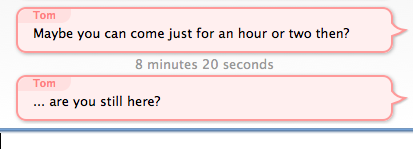
Message arrived a while ago: screenshot of the area at the bottom of the conversation with a lot of space and the time displayed

3. When did I say that?

This question occurs occasionally when looking for something in the backlog (typically using the findbar). In this case, the time is actually the desired information, but seconds are irrelevant, so only the hour and minutes need to be displayed. For this case, I decided to display the time of the first message of a bubble when the bubbles is hovered:

hovered bubble

4. What was the time of a specific message?

This rather rare question was already addressed with a little known feature of the existing bubble theme: when hovering a message, a tooltip appears showing a timestamp for that specific message.

5. When quoting messages (to paste in emails for example), I need the messages to have some time information associated with them in plain text!

While this is a valid concern, it’s out of the scope of the message theme design, as Instantbird 0.2 already supported a nice feature that we called “magic copy”: when a selection inside a conversation is copied into the clipboard, Instantbird will detect which messages are selected, and “prettyprint” them so that whatever message theme is currently in used doesn’t change the appearance of quoted messages.
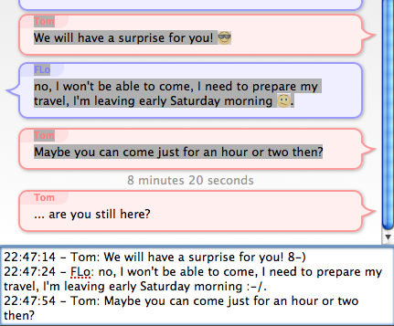
the input box with a copy of some selected messages

Conclusion

I have experimented with all of these suggestions for over a year already with a modified version of the Bubble theme, called “Time Bubbles” which was in an add-on. As the results of the experiment were satisfying, the “Time Bubbles” feature is now part of the Bubbles theme which is used by default in Instantbird. You can try it in current nightly builds, and it will be in Instantbird 0.3 beta 1 which we plan to release very soon. We look forward to your feedback on this!

Context Menus

Context menus (opened with a “right click”) are a common and expected part of the user interface. It can be very frustrating when they are missing, so in Instantbird 0.2 we tried to add one wherever users are likely to expect one.

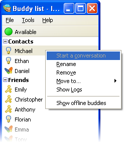
In the buddy list, the context menu of contacts can be used to start a conversation (although pressing enter or double clicking is usually faster), show the conversation history, rename a contact, move the contact to a different group or remove it from the list:

Buddy context menu

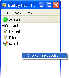
The context menu is usable anywhere in the buddy list to toggle the display of offline buddies:

Buddy list context menu

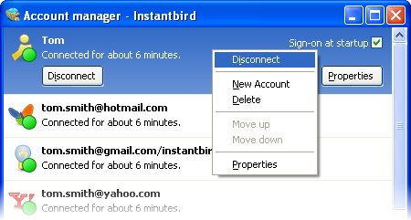
A context menu was added in the account manager too. There, it proposes all the possible actions for an account. Since Instantbird 0.2, it’s possible to reorder the accounts in the list (this is also possible with drag & drop using the mouse or with the keyboard using shift + the up or down arrow).

Account context menu

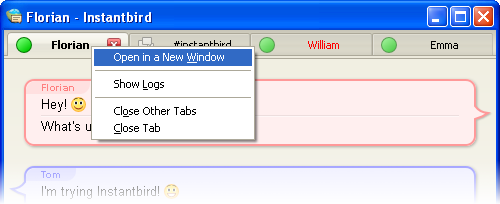
A context menu is available on conversation tabs, with actions related to that tab (opening it in a new window, closing it, …) and to the conversation, like showing the history of previous conversations with the same contact.

Tab context menu

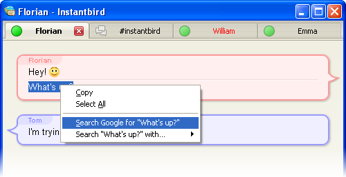
Last but not least, there’s a context menu in conversation content. This is the most “contextual” context menu we have added. The proposed actions will vary depending on whether there is a selection or if the context click was done over a link.

Content context menu

When selecting some text from a conversation, a common action is to copy it to the clipboard and then paste it in a browser to use it as the query in search engine. We have included search engine items directly in the context menus to reduce the number of clicks needed for this common case.

Cleaner UI

In Instantbird 0.2 a lot of visual bloat has been removed from all windows. Some margins have been reduced, borders that weren’t useful for clarity have been removed, and alignments have been improved. All of this contributes to a better use of the available space on the screen, and to a better perceived impression of simplicity in the user interface.

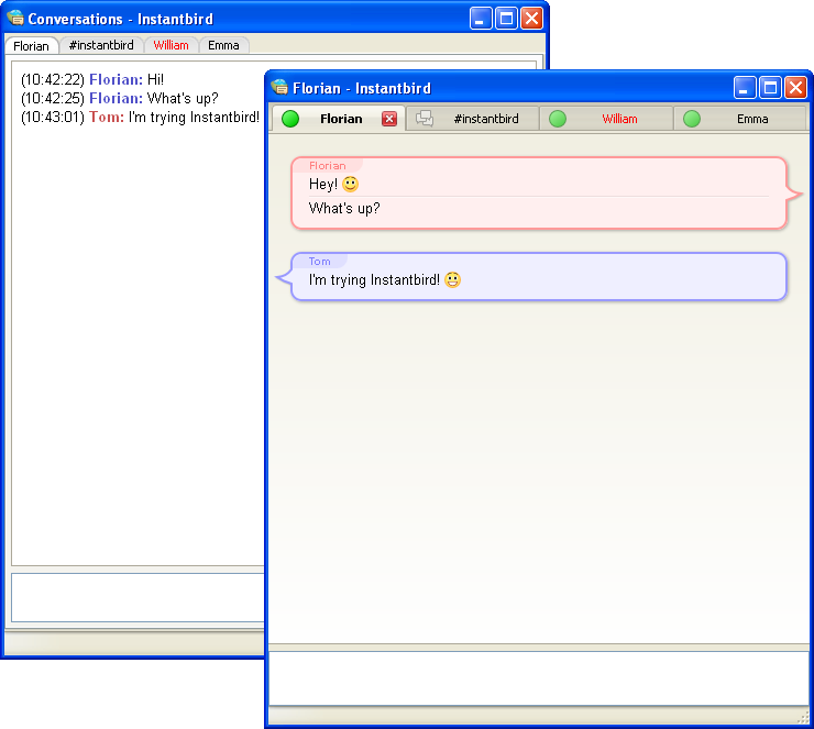
To illustrate this, let’s compare the conversation window before and after:

Conversation windows in Instantbird 0.2 and 0.1.3

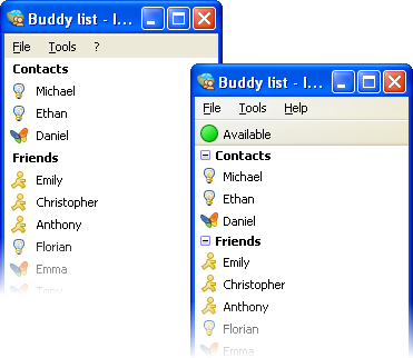
The buddy list has also been improved:

Buddy list windows in Instantbird 0.2 and 0.1.3

The status can now be changed directly from the top of the buddy list instead of having to interact with a poor popup dialog. (Note that for the users who hate clicking, the status can also be changed quickly using commands from conversation windows: /away /dnd /back /offline.)

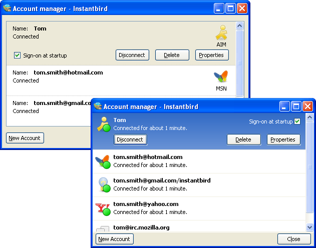
The account manager has also been simplified a lot, and is now usable in a much smaller window:

Account manager windows in Instantbird 0.2 and 0.1.3