Major update to Instantbird 0.2

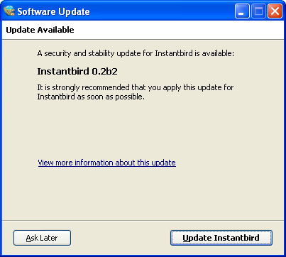
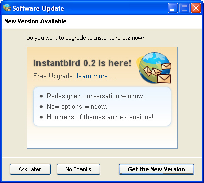
As no critical issues have been reported in the recently released Instantbird 0.2, we have turned on major updates for users of Instantbird 0.1.2 and 0.1.3. If you are still using one of these old versions, you will receive a major update offer to get the newer Instantbird 0.2. It will look like this:

Major update offer dialog

Unfortunately, due to a bug of the updater that shipped in the Windows version of Instantbird 0.1.3.1, the update won’t be automatic for these users, who should download the full installer themselves. We are sorry for the inconvenience.

Tip for MacBook users

Instantbird 0.2 uses the multitouch feature of Macbook touchpads in conversation windows:

  • Pinch in or out 2 fingers to change the zoom level.
  • Swipe up (3 fingers) to scroll to the top of the conversation, down to scroll to the last message. This saves time when looking for an old messages in the conversation (for example, using the Find feature) and then going back to the display of the most recent messages.
  • Twist left or right to select the tab at the left or right of the currently selected tab.
  • Swipe left or right (3 fingers) to change the selected tab to the previously selected tab. This gesture is probably the most useful one: it’s very convenient when reading quickly a message in a newly opened tab and then going back to the conversation tab where an active conversation is occurring, or when actively participating in 2 discussions and repeatedly switching between 2 tabs.

Instantbird 0.2 released!

After months of development and a few pre-release versions, we are happy to announce that Instantbird 0.2 is now ready to be put in the hands of the general public.

Instantbird 0.2 is now available in 5 languages thanks to the great work of our translators.

If you have tried Instantbird 0.1 back in 2007 when it was first released, Instantbird 0.2 may feel like a completely different software to you. The most dramatically changed area is the conversation window (for example, new tabs and message styles), but there are notable changes in almost every window. For a list of changes, see the release notes.

Let’s stop talking, so that you can discover Instantbird 0.2 now!

Instantbird logo

In the next few days, we will talk about our plans for the future, and especially Instantbird 0.3. Stay tuned!

Context Menus

Context menus (opened with a “right click”) are a common and expected part of the user interface. It can be very frustrating when they are missing, so in Instantbird 0.2 we tried to add one wherever users are likely to expect one.

In the buddy list, the context menu of contacts can be used to start a conversation (although pressing enter or double clicking is usually faster), show the conversation history, rename a contact, move the contact to a different group or remove it from the list:
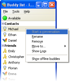
Buddy context menu

The context menu is usable anywhere in the buddy list to toggle the display of offline buddies:
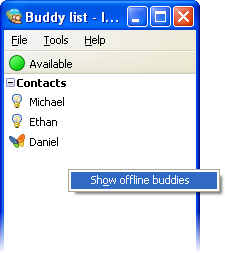
Buddy list context menu

A context menu was added in the account manager too. There, it proposes all the possible actions for an account. Since Instantbird 0.2, it’s possible to reorder the accounts in the list (this is also possible with drag & drop using the mouse or with the keyboard using shift + the up or down arrow).
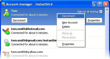
Account context menu

A context menu is available on conversation tabs, with actions related to that tab (opening it in a new window, closing it, …) and to the conversation, like showing the history of previous conversations with the same contact.
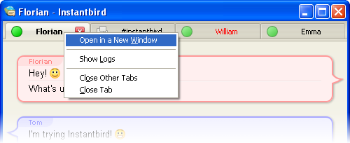
Tab context menu

Last but not least, there’s a context menu in conversation content. This is the most “contextual” context menu we have added. The proposed actions will vary depending on whether there is a selection or if the context click was done over a link.
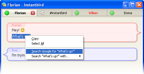
Content context menu

When selecting some text from a conversation, a common action is to copy it to the clipboard and then paste it in a browser to use it as the query in search engine. We have included search engine items directly in the context menus to reduce the number of clicks needed for this common case.
Cleaner UI

In Instantbird 0.2 a lot of visual bloat has been removed from all windows. Some margins have been reduced, borders that weren’t useful for clarity have been removed, and alignments have been improved. All of this contributes to a better use of the available space on the screen, and to a better perceived impression of simplicity in the user interface.

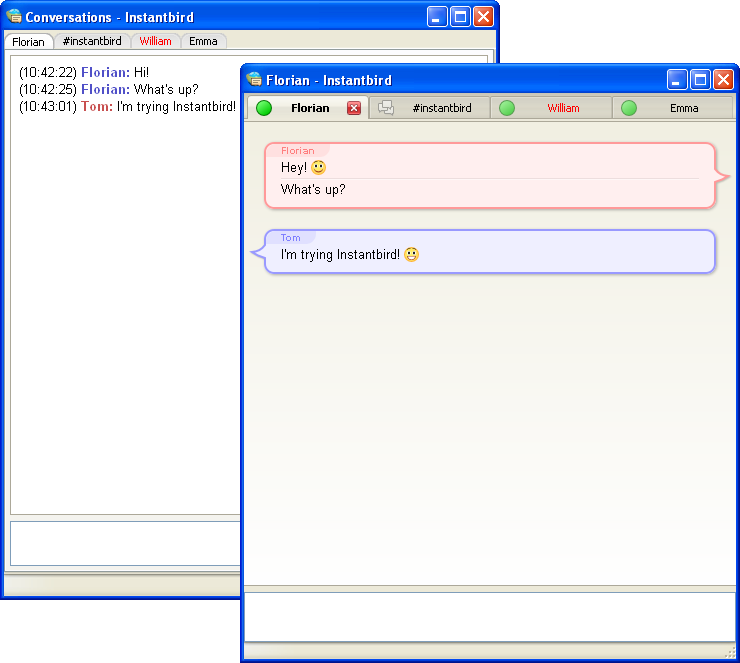
To illustrate this, let’s compare the conversation window before and after:

Conversation windows in Instantbird 0.2 and 0.1.3

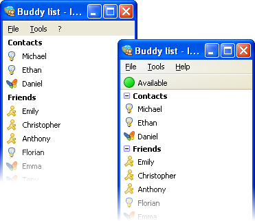
The buddy list has also been improved:

Buddy list windows in Instantbird 0.2 and 0.1.3

The status can now be changed directly from the top of the buddy list instead of having to interact with a poor popup dialog. (Note that for the users who hate clicking, the status can also be changed quickly using commands from conversation windows: /away /dnd /back /offline.)

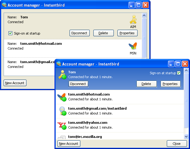
The account manager has also been simplified a lot, and is now usable in a much smaller window:

Account manager windows in Instantbird 0.2 and 0.1.3

Message Styles

As exchanging messages is the most important feature of an instant messaging client, we put a great deal of thought into the way the messages are displayed. As we have already explained, we decided to implement the Adium message style system. This system offers a great flexibility to message style authors to display the conversation content the way they want.

In order to give users a good out-of-the-box experience, we have packaged a variety of messages styles by default in Instantbird.

Bubbles

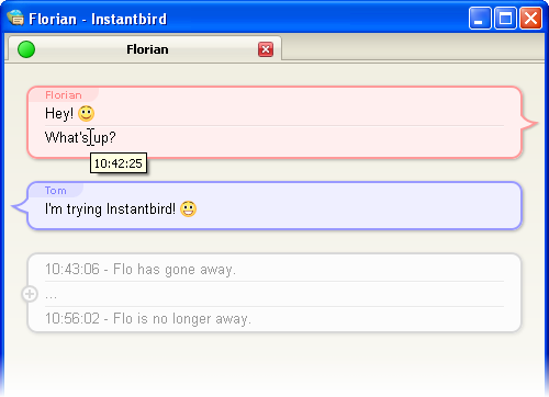
In Instantbird 0.1.*, the display of conversations was very simple (some may say boring!), and very similar to what Pidgin does. In Instantbird 0.2, the default message style, called “Bubbles,” is a lot more colorful.

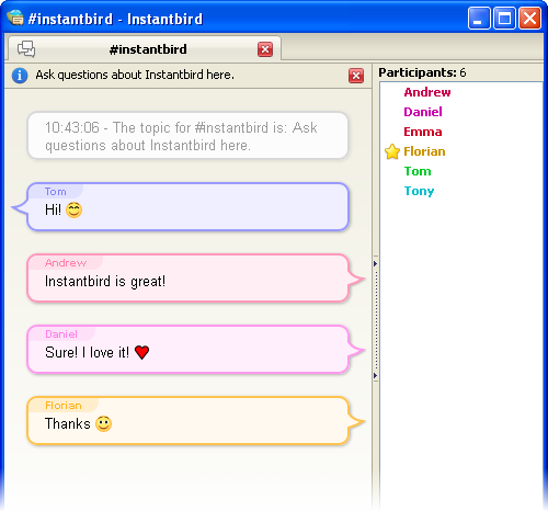
Messages are displayed in colored bubbles. In a private conversation with one other user, there’s a background color for your messages, and a color for the messages you receive. In multi-user chat rooms, there’s a different color for each participant, so you easily can tell which messages are sent by the same participant:

chat room with people talking in colorful chat bubbles

In this theme, the display of messages is clear and well spaced out. This theme was designed to be usable for most users.

A few special features have been added to this theme to improve the readability of conversations and reduce the waste of space: consecutive messages from the same person are grouped automatically, consecutive system messages are automatically grouped and collapsed, and the timestamps are no longer displayed for each message, but as a tooltip when a message is hovered.

Conversation using the Bubbles theme, with grouped messages and collapsed system messages

Because we know one theme cannot fit the needs of everybody, we provide a few other themes by default.

Dark

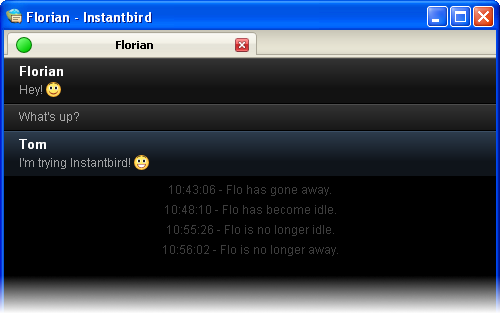
The “Dark” theme is designed to please people who like having a dark (almost black) background color in their windows.

Conversation using the Dark message theme

Paper Sheets

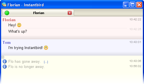
The “Paper Sheets” theme is a less fancy alternative to the default Bubble theme.

Conversation using the Paper Sheets message theme

Most of the features of Bubbles are also there, but it takes less space on the screen (no bubbles), and the colors are lighter.

The margins used in this theme automatically adapt based on the total size of the conversation area, in order to save space if you decide to use a very small conversation window.

Simple

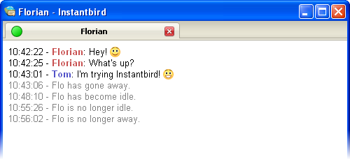
As we know some people may feel nostalgic, hate fancy stuff, or simply want to have a very compact message theme, we have included a message theme called “Simple.” With this theme, all the space is used for the conversation messages.

Conversation using the Simple theme

Finally, a little reminder about extensibility: even though the themes included by default have been designed to fit the needs of most users, they may not fit perfectly your personal taste, and that’s why there are hundreds of message themes already available for you to enjoy trying out. Creating a new one yourself is also very easy.

Stability

We care a lot about the stability of Instantbird. Again, the Mozilla platform has some great tools to help us here.

Crash Reporting

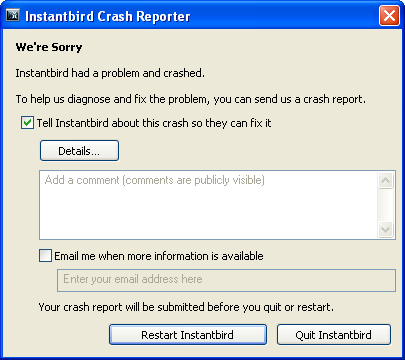
In the unfortunate event of a crash, a window apologizing for the interruption in your work flow will pop up, and suggest you send some anonymous information about this issue to our servers. We can then analyze it and fix it for a later version, to make Instantbird more stable for you.

Instantbird Crash Reporter dialog

This crash reporting system has already helped us a lot to improve the overall stability of Instantbird.

Crash detection and protection

In previous releases, the worst stability problem that occurred was a crash during start up (while automatically connecting accounts). This was very annoying since it was not possible to use the graphical user interface to change the configuration of the accounts likely to be related to the crash.

In Instantbird 0.2, we have addressed this issue by detecting if the last connection attempt finished correctly, that is, without the application being quit unexpectedly.

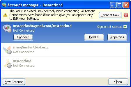
Start up crashes are very rare and you will most likely never run into one, but if it does occur to you: don’t worry! At the next start up, you will see the account manager pop up with a message explaining the situation and inviting you to either retry connecting or edit the configuration of your accounts:

Account manager with automatic connection disabled and an error message explaining the problem

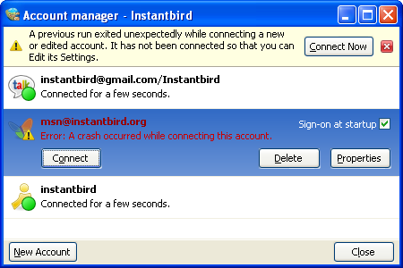
If the crash occurred after you added an account or changed the configuration of an account, this account will be the only one that won’t connect at the next startup, and the message in the account manager will look like this:

Account manager where an account was disabled because of a crash during the last connection attempt.

Updates

When we identify the cause of common crashes, or when a serious issue is discovered (for example, an IM network no longer works), we try to quickly release a new minor version including a fix for the issue.

Instantbird will periodically check for updates and notify you automatically if a newer version is available. If you accept the update, it will then be downloaded automatically and applied during the next start up.

Dialog prompting the user to accept a security and stability update

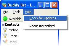
If you expect a new version, you can also force Instantbird to check now for an updates, using the “Check for updates” menu item:

Check for updates menu item

Nightly builds

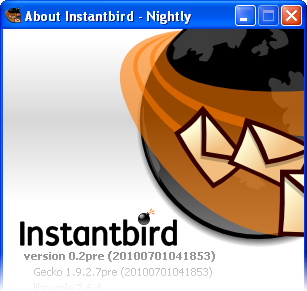
People who want to very closely follow the development of Instantbird can decide to receive the latest development version daily through this update system. We call these versions the “nightly builds.” These builds are produced automatically every day so that new issues can be detected early on, before they creep up into release builds.

About dialog of a Nightly build of Instantbird

Feel free to use them, but watch out! They may not be stable, and if you decide to use them, you are expected to do so to help us test the bleeding edge features, not just be a cool kid who’s got the new toy first. So if there are bugs, please report them (Filing a bug: what a bug report should contain) instead of complaining.