The contact list was identified as a weak area of Instantbird 0.2. It has been dramatically improved for Instantbird 0.3 which we plan to release next week.
Tags
Goodbye groups
Like most IM clients, Instantbird 0.2 had each contact placed in a group, leading users to organize contacts a bit like files are placed in folders on the disk.
While this seems ok at first, placing contacts inside groups doesn’t work well when thinking of the contact as a person. Don’t you have a friend (group ‘friend’) who is also a coworker (group ‘colleagues’)?
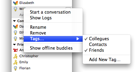
For this reason, with Instantbird 0.3 we replaced the notion of “Groups” with the notion of “Tags” throughout the user interface. While groups used to be containers for your contacts (it was possible to move a contact from one group into another), tags are additional data attached to the contact (you can add or remove tags on a contact, but no longer ‘move’ a contact) and thus a single contact can have multiple tags. To change the tags attached to a contact, use the “Tags…” context menu item of the contact; it shows a list of the existing tags with a check mark next to the tags attached to the selected contact. Checking/unchecking a tag in this list will attach/detach a tag from the contact.

Grouped contacts
If several networks are usable to IM the same person, you will no longer be annoyed by seeing that person listed several times in your contact list. Just drag and drop one of these contacts onto another and Instantbird will know they are both ways to contact the same person.
During future conversations, if your contact suddenly starts talking to you from a different network, the conversation will continue in the same tab. A system message will be displayed in the conversation to unobtrusively notify you of this change.
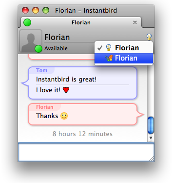
If you want to start talking to a different account of your contact, you can do so easily with a click on the protocol icon at the top right of the conversation UI:

When starting a conversation from the contact list, Instantbird will automatically select the best way to reach your contact, based on availability information and your preference with regard to the various ways to contact this person. You can change this preference by expanding a contact (with the down arrow icon) and then using drag and drop to reorder the accounts.

Other noticable changes
- The contact list is now sorted: both tags and contacts inside a tag appear alphabetically sorted.
- Changes in the displayed information are smoothly animated, making them at the same time easier to understand and less interrupting.
- Closing the contact list window, which is not needed all the time, will no longer close Instantbird. On Windows and Linux it will be minimized to the system tray (this behavior can be customized in the Preference dialog); on Mac it can be easily reopened from the menubar.

I don’t recall the portrait/icon to be in version 0.2. Or was it?
Anyway.. it’s a change that I found to be noticeable. ;)
Kudos to the Instantbird team!
Can’t seem to download 0.3, get ACCESS DENIED and can’t find it on the site, where can I get it from??? :-)
@Roflo: The user icon will give me material for another post (hopefully tomorrow) ;).
@aSystemOverload: 0.3 final hasn’t been released yet, we plan to release it next week (I’ve just edited the first paragraph of the post to clarify this). All the features described in this post are already available in Instantbird 0.3 beta (there’s a link on the home page, labeled “Try Instantbird 0.3 beta!”). I’m glad to see you are eager to download it :).
@Roflo If you’re talking about the user icon in the conversation window, that’s new. I believe we’ll have a blog post abou tthat soon too.
@aSystemOverload Instantbird 0.3 is not released yet, it will be released next week. You can download the beta from http://instantbird.com/download-0.3b1.html
Hi, first it’s a very nice IM, but there is one important point - managing/ deleting tags. Is there any way to do this or do I have to wait for the next release?
@Norman: It’s not supported yet. By the way, any idea of what could be a good user interface for that?
@Norman: What’s the motivation for wanting to delete a tag? If the tags that are empty weren’t visible in the ‘Tags…’ context menu, would that solve your issue?
@Florian: Motivation? Order! Frankly, there is no buddy in my list with tag “xyz” but in the tag list there ist a tag called “xyz”. A good userinterface would be in the preferences; appearance and there something like “manage your tags”.
Just downloaded Instantbird and liking it so far. One Contact List setting I like on other IM clients that I’m missing on Instantbird is the ability to sort contacts based on status (i.e. those that show ‘available’ appear first in alphabetical order, followed by those that are away/busy again in alphabetical order).
Any chance that option will be included in the near future?
@Norman:
So if the tag list stopped listing the empty tags, you would have the order you crave without having to take the time do the work of actually removing these tags, wouldn’t you? :)
@David: We have a bug filed on this (Bug 701 - Sort buddies by status).
I wasn’t aware 0.3 was so far along for release as 1.0! I didn’t realize this partly because I kept thinking that the Buddy List was seriously broken because I couldn’t grab and drag buddies to rearrange them in the list. I’ve got 5 messenger accounts, several of which I’ve maintained for almost 10 years now and so when I say I have a *huge* buddy list, I’m not exaggerating. Being able to organize those buddies into discreet groups which I can then collapse so I don’t have to see them is extremely important for me. Tags does the opposite of that, if you drag buddies around you end up with more and more copies of them all over the place. And when you “close” a tag it just moves all of the untagged buddies down to the bottom instead of hiding them. I *need* my groups! This isn’t just a matter of me being old fashioned, compartmentalization is the only way I can keep up with all of these people and organize them. Is there any way we can have the option to choose *between* Groups and Tags? Or have Tags be a totally separate interface?
@patrickjdempsey I have about 20 accounts, some of which I’ve had for about 10 years too, and thousands of buddies, so I don’t think this point is relevant here.
“if you drag buddies around you end up with more and more copies of them all over the place” this sentence makes no sense to me. Drag and drop is used to merge buddies into contacts, it’s not related to tags or groups (and a contact has all the tags of the buddies that compose it, but it doesn’t add more).
“when you “close” a tag it just moves all of the untagged buddies down to the bottom instead of hiding them.” I don’t understand this either. Or are you maybe confusing closing and hiding a tag? To close a tag, double click on its name or click on the icon at the left of the name. Closing a tag is useful for people you want to have in a separate place, but don’t need to interact with at the moment. Hiding a tag is a completely different operation (done with the [X] icon at the right of the tag name, or from the context menu) to ignore tags that are totally meaningless without having to remove the tag from each of the contained contacts.
I hope this clarifies things, if it doesn’t, please do get back to me as I would like to understand your problem if there is one beside the apparent confusion. In any case, thanks for your feedback! :)
Ok, I’m seeing now that I can collapse the tags without closing them… that really confused me when I hit the X button and the contacts moved around.
The dragging thing is really confusing for me. In every UI I’ve ever used dragging an item from one place to another place physically moves it. In this new system dragging items does not move them as I would expect. In fact, a whole series of unexpected things happen when you drag a buddy. Instead of an item disappearing from one list and appearing on another like in the old system, the item disappears altogether and it’s old position is renamed to the new buddy name it’s been merged with. That’s two really unexpected actions at once. And it’s not easy to figure out how to correct that. Context menus are almost never intuitive! I feel like you’ve hidden all of the important UI interaction behind context menus and made the upfront UI difficult to understand. There’s also a bug where sometimes contacts get renamed to the name of the buddy they are merged with that makes it even more confusing! I notice you do have the note “drop a contact her to merge it” but this only appears in an expanded contact list, which most users will not notice at first. These are some suggestions I have after playing around with the new system:
Also, is there a meta bug on improving the buddy list I can add some bugs to?
@patrickjdempsey: Thanks for the feedback! I’m not aware of a meta bug for the buddy list, feel free to create one if you feel the need :).
Note: we have never supported moving a buddy from a group into another by a drag and drop in the past.
You know what Florian… you are right.. I have no idea why I though you could before!
Maybe you have used Pidgin for years? ;)
Is there a way to massively move contacts from one tag to another… or maybe renaming a tag group from one name to another or to an existing tag group to combine them?
I have a ton of contacts and want to move multiple folks from under one tag to another, A way to do this would be greatly appreciated.