As exchanging messages is the most important feature of an instant messaging client, we put a great deal of thought into the way the messages are displayed. As we have already explained, we decided to implement the Adium message style system. This system offers a great flexibility to message style authors to display the conversation content the way they want.
In order to give users a good out-of-the-box experience, we have packaged a variety of messages styles by default in Instantbird.
Bubbles
In Instantbird 0.1.*, the display of conversations was very simple (some may say boring!), and very similar to what Pidgin does. In Instantbird 0.2, the default message style, called “Bubbles,” is a lot more colorful.
Messages are displayed in colored bubbles. In a private conversation with one other user, there’s a background color for your messages, and a color for the messages you receive. In multi-user chat rooms, there’s a different color for each participant, so you easily can tell which messages are sent by the same participant:
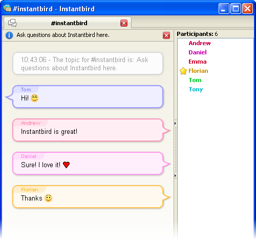
In this theme, the display of messages is clear and well spaced out. This theme was designed to be usable for most users.
A few special features have been added to this theme to improve the readability of conversations and reduce the waste of space: consecutive messages from the same person are grouped automatically, consecutive system messages are automatically grouped and collapsed, and the timestamps are no longer displayed for each message, but as a tooltip when a message is hovered.
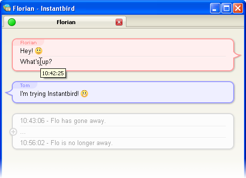
Because we know one theme cannot fit the needs of everybody, we provide a few other themes by default.
Dark
The “Dark” theme is designed to please people who like having a dark (almost black) background color in their windows.
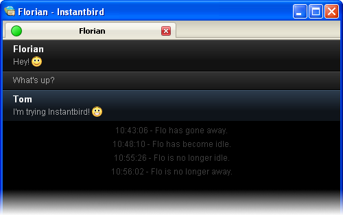
Paper Sheets
The “Paper Sheets” theme is a less fancy alternative to the default Bubble theme.
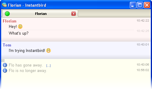
Most of the features of Bubbles are also there, but it takes less space on the screen (no bubbles), and the colors are lighter.
The margins used in this theme automatically adapt based on the total size of the conversation area, in order to save space if you decide to use a very small conversation window.
Simple
As we know some people may feel nostalgic, hate fancy stuff, or simply want to have a very compact message theme, we have included a message theme called “Simple.” With this theme, all the space is used for the conversation messages.
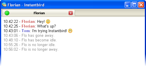
Finally, a little reminder about extensibility: even though the themes included by default have been designed to fit the needs of most users, they may not fit perfectly your personal taste, and that’s why there are hundreds of message themes already available for you to enjoy trying out. Creating a new one yourself is also very easy.
The message styles are nice and simple, but I’m wondering if there shouldn’t be at least one default message style that supports “headers” to have an avatar.
@patrickjdempsey: I tend to believe that we should display information about the contact in chrome rather than in the content, but until we do it, I agree it would be nice to have this available as an option for some or most of the default themes.
Gogogo guys :)