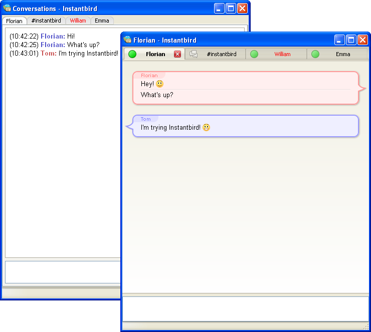
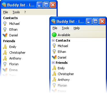
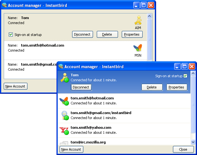
In Instantbird 0.2 a lot of visual bloat has been removed from all windows. Some margins have been reduced, borders that weren’t useful for clarity have been removed, and alignments have been improved. All of this contributes to a better use of the available space on the screen, and to a better perceived impression of simplicity in the user interface.
To illustrate this, let’s compare the conversation window before and after:

The buddy list has also been improved:

The status can now be changed directly from the top of the buddy list instead of having to interact with a poor popup dialog. (Note that for the users who hate clicking, the status can also be changed quickly using commands from conversation windows: /away /dnd /back /offline.)
The account manager has also been simplified a lot, and is now usable in a much smaller window:
