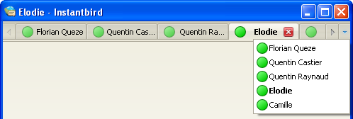
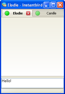
During the 0.2 cycle, we spent a lot of time reworking the conversation window. The conversation window will now feel more familiar to Firefox users. That’s because lots of parts have been borrowed and adapted. In this post, and the next few posts, we will present features that are already present in Firefox, but have been adapted for Instantbird.
Let’s begin with tabs: conversations appear in tabs that work exactly the same way as in Firefox 3.6.
Tab sizing
Tabs are sized to take full advantage of the available space: when there are only a few tabs, their width allows seeing most of the title of the conversations, and a close button is visible on each tab, making it easy to close a tab with a single click.

If there are more tabs or if the window is smaller, the tabs shrink, and the close button remains visible only on the selected tab to save space.

If the space is really too limited to fit all the conversation tabs, the tab bar becomes scrollable and a button appears to give the user a way to display a list of all tabs at once.

All this makes very small conversation windows usable.

Drag and drop
Tabs can be easily reordered, just drag a tab and drop it where you wish it to be.

Dropping a tab elsewhere detaches the tab to create a new window. The new window appears where the tab was dropped.

Tabs can also be dragged between windows:

OS integration
On Mac OS X, the active conversation window is easy to distinguish from the others, thanks to different colors of the tabs.

Superb work! I wish we could have those beautiful mac color and frames on Windows!! This looks so sexy on the mac.
You can improve the Mac style a little: Instead of using titlebarcolor, just put a 2px high strip under the titlebar that has -moz-appearance: -moz-mac-unified-toolbar, and then hide its dark bottom border by pulling the tabs over it using margin-top: -1px. Then you will have a nice gradient in the titlebar and it will look exactly like the tabs in Terminal.app.
Thanks for the tip! :)
Has any thought been given to a vertical tab option? I know it’s inconsistent with browsers, but it can be very convenient for chatting. I frequently chat with lots of people at the same time, more than can fit in the active portion of a horizontal tab bar. Vertical tabs are about the only thing I miss from my old Adium days.
@Luke: an add-on is being developed for vertical tabs. I don’t know when it’s going to be released, but given that the author comes in the #instantbird IRC chatroom and seems to work on it almost every day, I guess it’s going to be ‘soon’ :).
Vertical tabs are available on the addons site:
https://addons.instantbird.org/en-US/instantbird/addon/244
Can’t we just get rid of the title bar like Firefox 4 and like Trillian have done with Trillian 5?