Introducing Time Bubbles

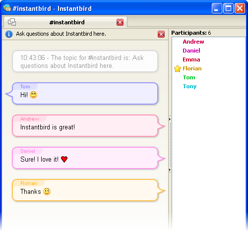
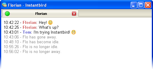
Instantbird 0.2 was released with Bubbles as its default message theme:

default message themes of Instantbird 0.2

The most common feedback we received from users that quickly switched back to Simple (the previous default) or another theme was that the lack of timestamp for each message made the theme unusable.

Some users have really passionate opinions about whether these timestamps should be shown or not. On one hand, people think it’s a useful piece of information that should always be visible, but on the other hand, people think it’s a waste of space on their limited screens. The common “solution” to this problem is to include a “show timestamp” preference, allowing each user to decide for themselves which of the two behaviors is the least inconvenient.

I don’t think that making the user responsible for choosing between two not-so-good options which one is best is a good way to address this issue. So soon after the 0.2 release, I started searching for better solutions.

I tried to identify what the information provided by message timestamps was used for, so that we could hopefully find something appropriate for the actual needs.

The starting points of my reflection were that:

  • timestamps, when visible, are most of the time ignored.
  • when they are actually read, the information they provide is rarely the information really desired, but only an indirect way to answer a valid question.

So then, I tried to identify which questions users who wanted to have their timestamps visible all the time had to answer. Here are the questions I found, and what I’ve implemented to provide human friendly answers to these questions:

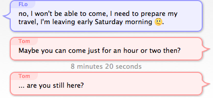
1. How much time has passed between 2 messages?

That’s actually still an indirect answer to another question: has that person talking to me actually read what I said and thought about it before replying? Sometimes when receiving an answer that doesn’t seem to take into account what has just been said, it’s just that the message wasn’t read yet at the time the reply was written.

I believe having to read and compare mentally 2 timestamps to get that information is overly complicated and we can convey this information visually:

screenshot with 2 bubbles touching each other, and 2 bubbles with some space between them

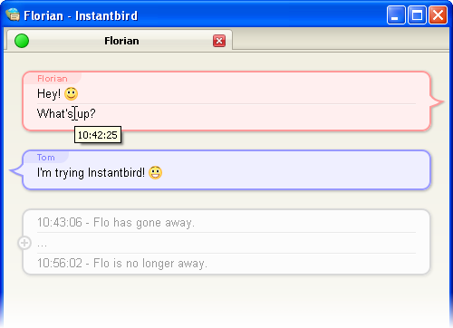
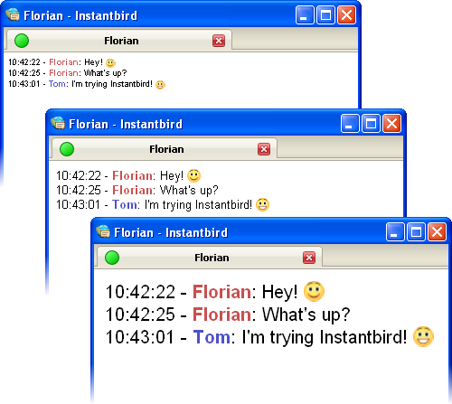
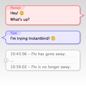
The vertical space between Bubbles is used to show how much time separates messages. If 2 people talked at the same second, their bubbles will almost touch each other. If there’s been a pause between the messages, there will be some space between the bubbles.

In order to not waste too much space when 2 messages are separated by a long time, I decided that the first few seconds would cause a much bigger increase of the space than the next seconds and minutes (for the readers who care about the details: it’s a logarithmic representation of the time).

This makes it easy to see a difference in time just after a message was received (the very few seconds that make the difference between a likely-read message and a most-likely-not-read-yet message), but makes it hard to evaluate time intervals of several minutes. To address that, when messages are separated by over 5 minutes, the exact time is displayed between the bubbles in gray text:

screenshot of 2 messages with over 5 minutes of interval

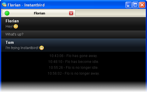
2. Is this message old?

This question is especially interesting when returning to the computer after being away, and having several conversations with new messages, to decide which one to answer to first. If a message has already been waiting there for an hour or so, the person has probably moved on already, and is most likely not actively waiting for your answer. However, if a message was sent only a few seconds or minutes ago, it’s reasonable to expect that the person is still at the other end and still remembers what was discussed.

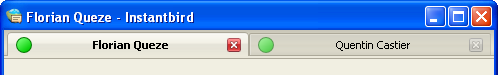
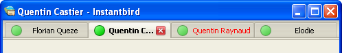
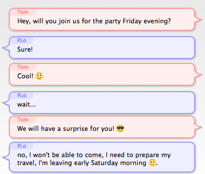
To answer this question, my proposition is to make the space between the latest message and the text input box vary exactly like the space between 2 bubbles. Unlike the time between 2 bubbles which doesn’t change, the time between the last message and now changes continuously, so displaying this time requires an animation: messages will “scroll away” as they get old. If a message is older than 5 minutes, the time since it appeared will be written (omitting seconds, so that the text displayed doesn’t change continuously).

Just arrived message: screenshot of the area at the bottom of the conversation without space

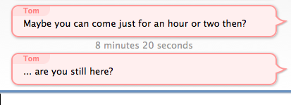
Message arrived a while ago: screenshot of the area at the bottom of the conversation with a lot of space and the time displayed

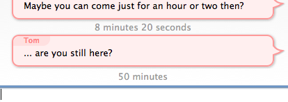
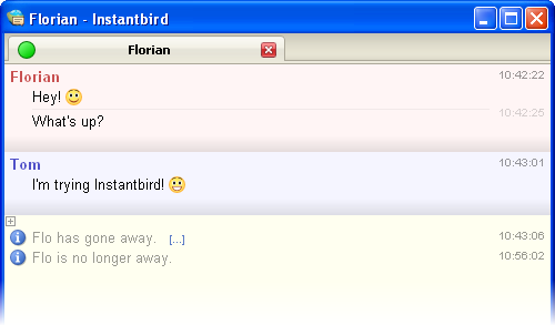
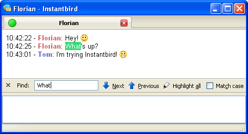
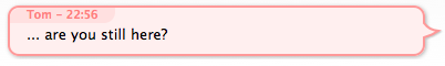
3. When did I say that?

This question occurs occasionally when looking for something in the backlog (typically using the findbar). In this case, the time is actually the desired information, but seconds are irrelevant, so only the hour and minutes need to be displayed. For this case, I decided to display the time of the first message of a bubble when the bubbles is hovered:

hovered bubble

4. What was the time of a specific message?

This rather rare question was already addressed with a little known feature of the existing bubble theme: when hovering a message, a tooltip appears showing a timestamp for that specific message.

5. When quoting messages (to paste in emails for example), I need the messages to have some time information associated with them in plain text!

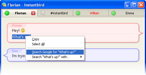
While this is a valid concern, it’s out of the scope of the message theme design, as Instantbird 0.2 already supported a nice feature that we called “magic copy”: when a selection inside a conversation is copied into the clipboard, Instantbird will detect which messages are selected, and “prettyprint” them so that whatever message theme is currently in used doesn’t change the appearance of quoted messages.

the input box with a copy of some selected messages

Conclusion

I have experimented with all of these suggestions for over a year already with a modified version of the Bubble theme, called “Time Bubbles” which was in an add-on. As the results of the experiment were satisfying, the “Time Bubbles” feature is now part of the Bubbles theme which is used by default in Instantbird. You can try it in current nightly builds, and it will be in Instantbird 0.3 beta 1 which we plan to release very soon. We look forward to your feedback on this!

Context Menus

Context menus (opened with a “right click”) are a common and expected part of the user interface. It can be very frustrating when they are missing, so in Instantbird 0.2 we tried to add one wherever users are likely to expect one.

In the buddy list, the context menu of contacts can be used to start a conversation (although pressing enter or double clicking is usually faster), show the conversation history, rename a contact, move the contact to a different group or remove it from the list:

Buddy context menu

The context menu is usable anywhere in the buddy list to toggle the display of offline buddies:

Buddy list context menu

A context menu was added in the account manager too. There, it proposes all the possible actions for an account. Since Instantbird 0.2, it’s possible to reorder the accounts in the list (this is also possible with drag & drop using the mouse or with the keyboard using shift + the up or down arrow).

Account context menu

A context menu is available on conversation tabs, with actions related to that tab (opening it in a new window, closing it, …) and to the conversation, like showing the history of previous conversations with the same contact.

Tab context menu

Last but not least, there’s a context menu in conversation content. This is the most “contextual” context menu we have added. The proposed actions will vary depending on whether there is a selection or if the context click was done over a link.

Content context menu

When selecting some text from a conversation, a common action is to copy it to the clipboard and then paste it in a browser to use it as the query in search engine. We have included search engine items directly in the context menus to reduce the number of clicks needed for this common case.

Cleaner UI

In Instantbird 0.2 a lot of visual bloat has been removed from all windows. Some margins have been reduced, borders that weren’t useful for clarity have been removed, and alignments have been improved. All of this contributes to a better use of the available space on the screen, and to a better perceived impression of simplicity in the user interface.

To illustrate this, let’s compare the conversation window before and after:

Conversation windows in Instantbird 0.2 and 0.1.3

The buddy list has also been improved:

Buddy list windows in Instantbird 0.2 and 0.1.3

The status can now be changed directly from the top of the buddy list instead of having to interact with a poor popup dialog. (Note that for the users who hate clicking, the status can also be changed quickly using commands from conversation windows: /away /dnd /back /offline.)

The account manager has also been simplified a lot, and is now usable in a much smaller window:

Account manager windows in Instantbird 0.2 and 0.1.3

Message Styles

As exchanging messages is the most important feature of an instant messaging client, we put a great deal of thought into the way the messages are displayed. As we have already explained, we decided to implement the Adium message style system. This system offers a great flexibility to message style authors to display the conversation content the way they want.

In order to give users a good out-of-the-box experience, we have packaged a variety of messages styles by default in Instantbird.

Bubbles

In Instantbird 0.1.*, the display of conversations was very simple (some may say boring!), and very similar to what Pidgin does. In Instantbird 0.2, the default message style, called “Bubbles,” is a lot more colorful.

Messages are displayed in colored bubbles. In a private conversation with one other user, there’s a background color for your messages, and a color for the messages you receive. In multi-user chat rooms, there’s a different color for each participant, so you easily can tell which messages are sent by the same participant:

chat room with people talking in colorful chat bubbles

In this theme, the display of messages is clear and well spaced out. This theme was designed to be usable for most users.

A few special features have been added to this theme to improve the readability of conversations and reduce the waste of space: consecutive messages from the same person are grouped automatically, consecutive system messages are automatically grouped and collapsed, and the timestamps are no longer displayed for each message, but as a tooltip when a message is hovered.

Conversation using the Bubbles theme, with grouped messages and collapsed system messages

Because we know one theme cannot fit the needs of everybody, we provide a few other themes by default.

Dark

The “Dark” theme is designed to please people who like having a dark (almost black) background color in their windows.

Conversation using the Dark message theme

Paper Sheets

The “Paper Sheets” theme is a less fancy alternative to the default Bubble theme.

Conversation using the Paper Sheets message theme

Most of the features of Bubbles are also there, but it takes less space on the screen (no bubbles), and the colors are lighter.

The margins used in this theme automatically adapt based on the total size of the conversation area, in order to save space if you decide to use a very small conversation window.

Simple

As we know some people may feel nostalgic, hate fancy stuff, or simply want to have a very compact message theme, we have included a message theme called “Simple.” With this theme, all the space is used for the conversation messages.

Conversation using the Simple theme

Finally, a little reminder about extensibility: even though the themes included by default have been designed to fit the needs of most users, they may not fit perfectly your personal taste, and that’s why there are hundreds of message themes already available for you to enjoy trying out. Creating a new one yourself is also very easy.

Preferences dialog

The preferences dialog is a new feature in Instantbird 0.2 which will feel familiar to Firefox users. The overall appearance is the same, making you feel at home.

General tab of the preference dialog

Some of the options are also the same…

Themes tab of the preference dialog

… while some are very specific to Instantbird:

Advanced tab of the preference dialog

Conversation Tools

Some tools you already have in Firefox can help you manage your conversations in Instantbird:

Find

Trying to find where a topic or keyword was mentioned in a long conversation is a common action. Instantbird uses the same findbar as Firefox to provide a search facility inside conversations. Just press Ctrl + F (Command + F on Mac OS X) and the findbar will appear:

Findbar in conversation window

However, when looking for something in a conversation, the most recent match is probably the most interesting. That’s why for Instantbird we adapted the findbar to search from bottom to top by default.

Zoom

Having trouble reading the text in conversations or fitting all the content on a small screen? Then the zoom feature is for you.

The keyboard shortcuts are the same as in Firefox: Ctrl + + to increase the size, Ctrl + - to decrease, and Ctrl + 0 to reset to the default size (Command instead of Ctrl on Mac OS X).

same conversation zoomed at various scales

The changes in zoom settings are applied to all conversations at once and saved so that you do not need to adapt the zoom more than once.

Tabs

During the 0.2 cycle, we spent a lot of time reworking the conversation window. The conversation window will now feel more familiar to Firefox users. That’s because lots of parts have been borrowed and adapted. In this post, and the next few posts, we will present features that are already present in Firefox, but have been adapted for Instantbird.

Let’s begin with tabs: conversations appear in tabs that work exactly the same way as in Firefox 3.6.

Tab sizing

Tabs are sized to take full advantage of the available space: when there are only a few tabs, their width allows seeing most of the title of the conversations, and a close button is visible on each tab, making it easy to close a tab with a single click.

Top of conversation window with 2 tabs and some free space

If there are more tabs or if the window is smaller, the tabs shrink, and the close button remains visible only on the selected tab to save space.

Top of conversation window with 4 tabs, only one close button is displayed

If the space is really too limited to fit all the conversation tabs, the tab bar becomes scrollable and a button appears to give the user a way to display a list of all tabs at once.

Top of conversation window with overflowing tabs, and the all tabs menu opened

All this makes very small conversation windows usable.

Very small conversation window with 2 tabs

Drag and drop

Tabs can be easily reordered, just drag a tab and drop it where you wish it to be.

dragging a tab, tab drop arrow visible in the same window

Dropping a tab elsewhere detaches the tab to create a new window. The new window appears where the tab was dropped.

new window with only one tab

Tabs can also be dragged between windows:

dragging a tab, drop arrow visible in another window

OS integration

On Mac OS X, the active conversation window is easy to distinguish from the others, thanks to different colors of the tabs.

An active and an inactive conversation window on Mac OS X