Instantbird 0.2 was released with Bubbles as its default message theme:
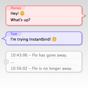
The most common feedback we received from users that quickly switched back to Simple (the previous default) or another theme was that the lack of timestamp for each message made the theme unusable.
Some users have really passionate opinions about whether these timestamps should be shown or not. On one hand, people think it’s a useful piece of information that should always be visible, but on the other hand, people think it’s a waste of space on their limited screens. The common “solution” to this problem is to include a “show timestamp” preference, allowing each user to decide for themselves which of the two behaviors is the least inconvenient.
I don’t think that making the user responsible for choosing between two not-so-good options which one is best is a good way to address this issue. So soon after the 0.2 release, I started searching for better solutions.
I tried to identify what the information provided by message timestamps was used for, so that we could hopefully find something appropriate for the actual needs.
The starting points of my reflection were that:
- timestamps, when visible, are most of the time ignored.
- when they are actually read, the information they provide is rarely the information really desired, but only an indirect way to answer a valid question.
So then, I tried to identify which questions users who wanted to have their timestamps visible all the time had to answer. Here are the questions I found, and what I’ve implemented to provide human friendly answers to these questions:
1. How much time has passed between 2 messages?
That’s actually still an indirect answer to another question: has that person talking to me actually read what I said and thought about it before replying? Sometimes when receiving an answer that doesn’t seem to take into account what has just been said, it’s just that the message wasn’t read yet at the time the reply was written.
I believe having to read and compare mentally 2 timestamps to get that information is overly complicated and we can convey this information visually:
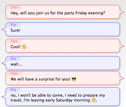
The vertical space between Bubbles is used to show how much time separates messages. If 2 people talked at the same second, their bubbles will almost touch each other. If there’s been a pause between the messages, there will be some space between the bubbles.
In order to not waste too much space when 2 messages are separated by a long time, I decided that the first few seconds would cause a much bigger increase of the space than the next seconds and minutes (for the readers who care about the details: it’s a logarithmic representation of the time).
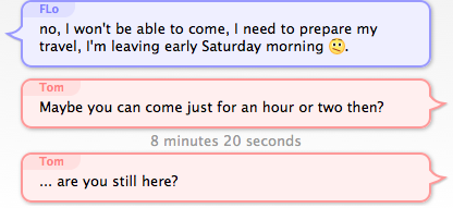
This makes it easy to see a difference in time just after a message was received (the very few seconds that make the difference between a likely-read message and a most-likely-not-read-yet message), but makes it hard to evaluate time intervals of several minutes. To address that, when messages are separated by over 5 minutes, the exact time is displayed between the bubbles in gray text:
2. Is this message old?
This question is especially interesting when returning to the computer after being away, and having several conversations with new messages, to decide which one to answer to first. If a message has already been waiting there for an hour or so, the person has probably moved on already, and is most likely not actively waiting for your answer. However, if a message was sent only a few seconds or minutes ago, it’s reasonable to expect that the person is still at the other end and still remembers what was discussed.
To answer this question, my proposition is to make the space between the latest message and the text input box vary exactly like the space between 2 bubbles. Unlike the time between 2 bubbles which doesn’t change, the time between the last message and now changes continuously, so displaying this time requires an animation: messages will “scroll away” as they get old. If a message is older than 5 minutes, the time since it appeared will be written (omitting seconds, so that the text displayed doesn’t change continuously).
Just arrived message: 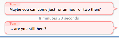
Message arrived a while ago: 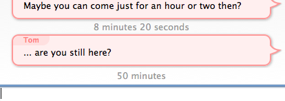
3. When did I say that?
This question occurs occasionally when looking for something in the backlog (typically using the findbar). In this case, the time is actually the desired information, but seconds are irrelevant, so only the hour and minutes need to be displayed. For this case, I decided to display the time of the first message of a bubble when the bubbles is hovered:

4. What was the time of a specific message?
This rather rare question was already addressed with a little known feature of the existing bubble theme: when hovering a message, a tooltip appears showing a timestamp for that specific message.
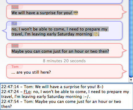
5. When quoting messages (to paste in emails for example), I need the messages to have some time information associated with them in plain text!
While this is a valid concern, it’s out of the scope of the message theme design, as Instantbird 0.2 already supported a nice feature that we called “magic copy”: when a selection inside a conversation is copied into the clipboard, Instantbird will detect which messages are selected, and “prettyprint” them so that whatever message theme is currently in used doesn’t change the appearance of quoted messages.
Conclusion
I have experimented with all of these suggestions for over a year already with a modified version of the Bubble theme, called “Time Bubbles” which was in an add-on. As the results of the experiment were satisfying, the “Time Bubbles” feature is now part of the Bubbles theme which is used by default in Instantbird. You can try it in current nightly builds, and it will be in Instantbird 0.3 beta 1 which we plan to release very soon. We look forward to your feedback on this!
This looks fantastic, excellent work Florian! It’s great to see so much thought has been put into something that seems simple at first glance.
“I don’t think that making the user responsible for choosing between two not-so-good options which one is best is a good way to address this issue.”
Couldn’t agree more, I’m so glad Instantbird is being developed with this sort of philosophy; when you look at clients like Miranda and they just cram in a million different options for a million different tastes and preferences, it’s just embarrassing :-)
If you add the timestamp next to the username you are not taking up additional space and people can easily get the time of whatever message they need the time of, instead of constantly guessing. For example, the iPhone has a similar system to time stamping messages, but to normal users the timestamps appear to be added randomly. Moreover, users don’t know the logic behind this complex timestamping scheme and are left to guess when estimating the timestamp of that one particularly message they’d like to know the time of.
Just show the timestamp right-aligned on the same line as the username, but in a color less strong. Having users guess how to access the timestamp seems counterproductive. You have to code more, users have to work harder, just to show basic information.
@Mads: I think you are likely to really like the ‘Paper Sheets’ theme (also installed by default): it shows the time stamp right-aligned, in gray for the first message of a group and light gray for the next messages (which turns to normal gray when hovering for better readability).
For your suggestion of showing the time on the same line as the username in the ‘Bubbles’ theme, I think you missed the fact that we display the username only for the first message of a group.
I certainly disagree with your feeling that “users have to work harder” when provided with the direct answer to their question, rather than having to read and compute the answer using a numeric representation of the time. I think I explained this in the post already :).
In any case, thanks for your feedback!
I’ve no stats on this but the number & size of support groups such as National Self Harm Network imply that some significant proportion of I.M users will be having intense chats. In these sorts of chats your eye is literally on the clock & the time stamps to keep the responses close enough that the person on the other end hasn’t time to do anything drastic or else to know that the silence has passed a critical benchmark (say how long a tourniquet has been on or an O/D taken. Admittedly these aren’t your typical chats but I suspect there are enough such out there to make a category that genuinely needs second by second time in the chats.
@Scarrer: Don’t the messages that scroll away (quite fast in the first seconds, and slower after because of the logarithmic scale) give a more accurate perception of silence than timestamps can do? Anyway, if you feel you have a very specific use case that diverges from what a typical chat may be, it’s totally OK to customize your instant messenger for that specific use case :). We have 4 different message themes included by default (look in the preferences dialog), and lots more to download from the add-ons website.